Here is the Official Category 1 Round 1 "The Recycled Fashion Look" Results.


ROUND 1: The Recycled Fashion Look
The photo must recreate a high fashion lay-out using only recyclable items for the outfit.
The photo must recreate a high fashion lay-out using only recyclable items for the outfit.
ROUND 1 FINALIST#10 (DAN) ENTRY COMMENTS

Here are the comments / critiques for FINALIST 10
I thought I was seeing the Next Iron Chef. But the items you used excited me. That is very creative. Even though much was covered, I can still see the slouch. I can see that you are not relaxed. You are pushing yourself into something else that it did not match the intensity your clothes had generated. I liked the squint, but it is a bit contrived.
This is the twist wherein the concept picture looks bad as compared to the recreated picture but both already used recyclable materials and are not fashionable. It looks as if a school presentation from his childhood. The model lost the fashion sense of this theme but focused on too much recycling.
Highs: Well used light.
Lows: You based your entry on a silly picture/peg… Why? This competition should not be taken lightly if you want to be successful.
ROUND 1 FINALIST#9 (CJ) ENTRY COMMENTS

Here are the comments / critiques for FINALIST 9
The concept and execution is good because he chose to actually re-enact the whole scene. I just wished he copied everything except for the facial expression of the girl because it looked awkward than being sexy. Nice try but I expect a better next round.
Now, this is truly a literal interpretation of the go green concept. The effort is outstanding and you visually translated the theme into reality. The effort you took to do this is commendable. As a model, you are still raw. You can still improve in the succeeding rounds. Overall, this is a safe entry. You will be able to do more in the next rounds.
Highs: Nice attempt. I love how you use a simple rice sack and made it look like a denim.
Lows: Neck down it's good. Face, mmm. Practice your facial expression. All I can see is your nostrils. Experiment on what looks good on you.
ROUND 1 FINALIST#8 (MAKI) ENTRY COMMENTS

Here are the comments / critiques for FINALIST 8:
Highs: wow!!! Speechless. I love it…
Lows: I don't like the background. I don't like the hair.
Almost all used plastics and I am having second thoughts whether plastics is indeed recyclable. You can project. The effort into creating the entry is obvious. The contrasting steel bar where you sat gave your photo contrast. You could have done something on your hair to make you more fierce, but that is ok. Only that you looked so small with your undulating trail. It is hugging the limelight out of you.
The concept picture overshadowed the recreated picture in terms of projection and even the clothing. It lacks intensity in the face, make-up, and the touch of red. The concept picture is a clever choice and I just wished it was given more justice.
ROUND 1 FINALIST#7 (RAYMOND CRIS) ENTRY COMMENTS

Here are the comments / critiques for FINALIST 7:
Highs: Now this is something I would use in a magazine. Nicely done. Good job!!!
Lows: You should have used your entire body in this picture. Please crop appropriately.
I liked the playful attitude. I like the way you handled color. I like the concept because it shows variety. But you may have looked a little bit awkward, or maybe that was how you conceptualized this. You looked like a discarded doll thrown away by a very bratty child. But the use of recycled materials was very very creative.
The model adhered to the theme but putting the two pictures side by side makes me wonder if it was really recreated. I love the garment because it looks Avant Garde while the make-up is gothic but the face lacks the necessary emotion to carry the entire look.
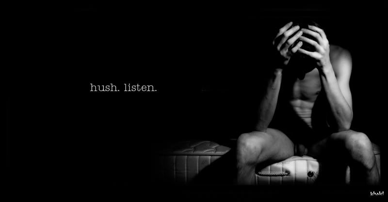
ROUND 1 FINALIST#6 (KHALEL) ENTRY COMMENTS

Here are the comments/critiques for FINALIST 6
The recyclable material is not that obvious and well utilized especially using a B/W effect. This looks like a second rate copycat of the concept picture. The eyes, again is dead as compared to the concept picture where you can still feel the intensity though it is a side view shot.
Now, you caught me flat-footed. Not only the effort showed as you integrated the green into the outfit itself and not the background, surely will make your entry worth noticing. I like the way you handled yourself. You are so full of confidence and I was impressed. That is more than enough for me.
Highs: Neck down it works for me…
Lows: Gee man. This is not recycled!!! I'm sorry but you paled miserably because of your un adherance to the theme. Your side view did not work for you. You should have just taken the inspiration from the pic and did your own interpretation.
ROUND 1 FINALIST#5 (CHRIS) ENTRY COMMENTS

Here are the comments / critiques for FINALIST 5:
My problem with this picture is that the concept picture looks better than the recreated picture in terms of the overflowing use of sex appeal. I salute the model for taking risk in showing his body w/c is in a way appealing but his face does not relate w/ what he wants to relay. It will also adhere more to the concept if he used a recyclable material instead of wearing his undies.
I liked the vastness of the background with all the newspapers around. I like Chris' bareness. I liked the brown floors. Truly earthy. The model - I liked the way his photographer did with the lights and focusing on him without suffocating him. He is sexy but not flirting. But he looked nervous. And I find him a little bit stiff, or was that supposed to be intentional? One good thing, he did not get drowned with the stacks of newspaper hugging the background.
I’m so SORRY though, i just realized that Chris was not wearing a recyclable outfit.
In this bareness, I got distracted by the newspapers around. a great photo though, but I must abide by the rules "The photo must recreate a high fashion lay-out using only recyclable items for the outfit."
He was not wearing any outfit at all to see the recycled materials. A bubbly bathrobe made of plastics can hardly qualify for something that is recycled.
Highs: I like your bubble wrap robe. It was hard for me to distinguish though.
Lows: You look like a miniature on the background you used. Your facial expression looks awkward. Practice on the mirror and be more expressive.
ROUND 1 FINALIST#4 (NJAMES) ENTRY COMMENTS

Here are the comments / critiques for FINALIST 4:
Highs: Nice photography. The natural lighting looks good on you.
Lows: Dude, you have a nice body. Use it!!! Sad to say, you cannot bank on your face alone. You look sad on your photo. Take risks… It might do you good.
I am overwhelmed by this batch. They have practically the same quality. Expressive Eyes! I admire the soft tone rendition of Njames' entry. The balance in which he crafted this entry is worth mentioning. He carefully took care of highlighting the theme, without taking the focus on him. The effect is gratifying because of that selflessness. The overall effect is simple serenity, fluidity.
Again the concept picture shined better than the recreated picture. It lacked the intensity especially in the eyes and use of facial muscles. The clothing looks elaborate but it fades away in terms of being chic and fashionable. This for me is a good but not a great execution.
ROUND 1 FINALIST#3 (RAFEE) ENTRY COMMENTS

Here are the comments/critiques for FINALIST 3:
Whew! I did not recognized you. You almost blew me over the top. The make-up is superb! And your fashion sense was never in doubt. But, there is something amiss. The description of what you added as recycled materials made me think - plastic straw? Aluminum foil? I never thought that they can be recycled though. But you blended them well in your portrayal. Only, it has lessened the impact I wanted to see "green" in your entry. They seem to be a little way off with your glamorous outfit.
Highs: Simply gorgeous. Well thought of. I didn't even notice that you are wearing a newspaper. Good Job. I hope you will be consistent…
Lows: The eyes look a little dead to me. You have a beautiful eyes, show it!!! Avoid hiding your neck. I would love to see you next on a full body picture.
This picture is amazing from all angles starting from the concept picture up to the execution. The model made the cheap materials look chic and fashionable. I also love the subtle and yet glamorous pose and eye contact. You set the bar high.
ROUND 1 FINALIST#2 (RODGE) ENTRY COMMENTS

Here are the comments/critiques for FINALIST #2
Highs: Nice face. Nice make-up. If I were to just judge you on your face. You'll be at the top of my list.
Lows: What we're you thinking when you put a nasty bag on your head? I doesn't work for me and to the theme for this week. It's not even fashion.
This is a very weak concept starting from the concept picture up to the actual execution. It was unimaginative and the item is not recyclable but more of a second hand accessory. One thing I appreciate is the way in which the model showed his eyes … and that made a slight difference and impact.
Hmm, surprisingly, very creative. Your depiction is strange. A macho Red Riding Hood! And very macho with the ropes. The red motif has overpowered you but you matched this with your very expressive eyes. Was that a leather hood? I was looking for a theme to go green but I didn’t see it.
Or was that so subtle that I cannot even detect it? Were it not for your creative rendering following the inspiration derived from the photo you sent, I would not have seen the theme at all. You really have the eyes. And that was your advantage.
ROUND 1 FINALIST#1 (ONI) ENTRY comments

Here are the comments / critiques for FINALIST 1:
Highs: The way he looks at the camera is enough to get an attention.
Lows: It looks ordinary to me. Nothing special. His facial expression lacks that factor to be considered as fierce.
The black and white motif was one that impressed me the most. some misgivings. I do not know if it is the strength or the weakness, but the dim intensity of the background made me ambivalent. As to the theme, there can be no doubt you stuck to it, but honestly I do not see the model, but rather a silhouette. Safe, so far. The black and white motif saved the day for you.
I prefer looking at the concept picture rather than the recreation. The original pic oozes a lot of sex appeal w/c is not present in the recreated picture. The face and eyes are dead and I see a very predictable recycled clothing. This will not create a good first impression.
________________
Finalist Number 10 was eliminated in the First Round.
Finalist Number 10 was eliminated in the First Round.
2 comments:
astig 'tong round na 'to ah.
ang mga finalist pa rin ba ang mag iisip ng isusuot? astig.
yes boying, the finalist and their team.
Next round: Elemental royalty!
Post a Comment