ROUND 2
"THE ELEMENTAL ROYALTY"

 What is an ELEMENTAL ROYALTY?
Simply defined in this competition to be Someone of Royal Lineage, (either a King, Queen, Prince, Princess, Lord, Lady, Duke, Duchess, etc.) who has the power to control one of the four elements - Fire, Earth, Air and Water.
With this in mind, let us read what the Judges have to say:
FINALIST #1 (ONI)

Highs: I love how the light touches your skin. Dramatic yet subtle.
Lows: I do not think it has something to do with the theme. It’s all mist and sparkle to me.
This is better than your first attempt but you are consumed by too much effects. One of your eyes is hidden and the other is just peaking through. I just wished you balanced the concept and you as the subject. Sometimes less is really more.
I LIKE THE VEILED LOOK BUT IT’S NOT MAJESTIC ENOUGH.
A star-spangled face cannot make anyone an elemental royalty.
This is a nice Picture, and nothing more. The Misty water effect doesn’t make you GOD looking. Ive Seen several perfume ads from a magazine looking exactly like this and you could have pulled this round off if you work well with your chosen element. The Projection is good and creativity is poor.
I seem to notice your penchant for the abstract, for the non-conformist style. I am beginning to like the way you submit your entries. There is character. But you have a weak portrayal. There is something lacking - the confidence.
This is a better entry than your first round, unfortunately it could have been better if you should more than your face. I could see the royalty and fashion in this entry eventhough the feel of the element of water is very evident.
FINALIST #2 (RODGE)

Highs: I should commend your make-up artist. The look is so reminiscent of Lawrence of Arabia.
Lows: Your picture is way out of adherence from the theme. I don’t get it…
This is better than your first attempt in terms of projection and even your outfit. I just need you to nail the concept and make it obvious. Just continue the progression of your projection and then merge it with the concept.
MMMMM….IS IT SNOWING?
Where's the "spirit of the wind"?
Most Models use their eyes to convey emotions depending on whatever theme a creative director and the photographer wants. And you communicated well with the camera. Pretty portfolio picture, but I felt something is lacking. Your projection is pretty awesome.
Better than the last one, but still short. You have to push yourself more into making us believe that you are a royalty.
Eventhough your face looks great, the element of air is not really felt so much. It could have been dramatic if you only had shown more of your body than just your cropped face. It could have worked for a perfume ad though.
FINALIST #3 (RAFEE)

Highs: Great Concept. Fire god with a bad-ass attitude. Nice effects, Great make-up, and nice body image. It is great that you listened to the critiques.
Lows: You should have submitted a bigger size file of your picture.
I am expecting a lot from you because of the potential I saw in your previous entry. You still grasped the concept but it was a bit X-men-ish for me. I cannot see the expression from your eyes because of the eye makeup and the distance of this shot. I applaud the versatility you are trying to impart from last week's feminine pose to this week’s rebellious villain. I hope your next interpretation is out of the box and extraordinary.
ITS TOO PUNKY.
One can "play with fire" with more gusto than the model's pose here. I like the way he used his hands and fingers but not his body angles. The eyes were also covered and upstaged by the pouted lips.
You know how to project, and in terms of creativity, Winner. This round, Fire is the most favorite element, challenge is how to stand out among the bunch of fire masters. Freshly baked, and a standout. You have a strong facial expression. You work well with the camera, right attitude for the element chosen. Fire sometimes is being use to symbolize Terror or Anger, and certainly this is not a classic. Congrats.
Cool is the way to describe this entry. May I ask if you are a modern elemental royalty? Your entry went against the stereotyped notion of what a royalty must look like. And apparently, you came in safe.
I couldn't see the royalty in this shot unless you are depicting a rebellious modern day fire prince. Overall, it's somehow out of the usual concept of royalty, nicely done and somehow shows a different side of who you are compared to your first round entry. Keep on surprising us.
FINALIST #4 (NJAMES)

Highs: Nice photography. I love the texture of the picture. I love the lightings and how the photographer played with the dimension of the scene.
Lows: Nice attempt but I do not see a royalty in the picture. A peasant perhaps. Sorry, but this does not work for me. Work on your angles. You don’t look like a model here.
I am starting to get bored with your pictures. I don't see a range of emotions and the shots were almost similar. I am not getting your concept in one glance but it needs more imagination and interpretation. I need you to exaggerate your facial expression and be more elaborate in your execution.
MMM YOU COULD HAVE DONE SOMETHING MORE , THAN JUST WEARING THE SHELL HEADPIECE…
I am not sure what element the model wanted to utilize. Shells can be found in the sea but once used to decorate one's body become elements of the earth. The model's eyes are meaningless, too.
Nice picture, but not great. This looks like the same as your previous entry. You are giving us the same look, where you can actually do so much with your facial expression. Try to be more fierceful, I think you’re playing it safe. Your competitors are very Edgy with their entries, fierce. I feel you have the potential to do that as well. You must be represeting water, if not for the seashells I would have mistaken this picture as some promotional Print Ad of some Local male Pageant. Hope to see more of your modeling potential next round, if you can make it to the next cut.
I have to admit. I have a prejudice for entries that were least edited. The nuances you make, you look like a benevolent royalty. But there is still room for much improvement. Safe, this time.
Something is lacking on the way you project yourself in this shot. It's not so exciting but it is a safe entry. I think you have some potential but you seem to not try coming up with a different look for your entry. It somehow looks overly the same and it tends to be boring.
FINALIST #5 (CHRIS)

Highs: Nice concept. Your facial expression look better compared with your previous entry. Nice body. Nice editing.
Lows: I’m not quite sure if this is fashion. I don’t know what you were modeling. The theme is somewhat fictional but you should not neglect the “fashion” of the theme.
I am seeing a trend that you are really comfortable getting naked and it works but I must warn you that monotony can lead to being predictable. I cannot clearly point what element you are trying to portray. I would appreciate if you used props instead of special effects to make it more fluid and believable. Do not be too complacent being naked.
THERE IS MOTION IN THIS PIC…I JUST WANTED THE EYES TO BE MORE EXPRESSIVE AND FIERCE.
The model succeeded in projecting himself as a superhero, an elemental royalty indeed. Though I would have wanted to see the left leg stretched out to avoid an illusion of an amputated leg, the photo was saved by model's projection, body angle, and color scheme.
This is earth, and you’re the super hero. I honestly like the picture, and it looks like an image from the creation of Jonathon Earl Bowser ( which by the way is my favorite Fantasy Art Artist) You should work more with your projection and use or put some intensity in your eyes. Even if you’re the toughest superhero you still look like the boy next door type. You are good looking, all in all this is nice.
You are improving. That is good. The photo was great. The editing was clean. The background was great. And you have excellently balanced the focus on your face and the shining hands. To me, that was excellent.
Nice concept. Better than the first round entry you submitted. Good work. Keep it up. Just bear in mind that you also have to show yourself dressed and not bank on too much exposure of your skin as it tends to be repetitive.
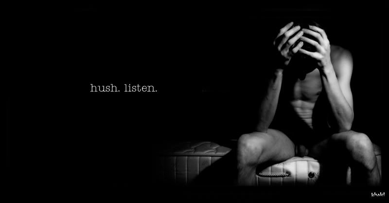
FINALIST #6 (KHALEL)

Highs: I love the effects on the pics. You truly look like a water god. Very sexy, yet very artistic. I love how the illustrator played with water and how he made you look like a water nymph.
Lows: You’re missing your limbs on the picture. Crop properly…
This is an improvement from your first picture but I can't see an expression from your face and eyes. Your concept is elaborate but it looked stiff just like your pose. I need to see that you are in command and not the background or special effects.
FACIAL EXPRESSION IS GOOD,IT BLENDED WELL WITH THE SPECIAL EFFECTS, … NEPTUNE?
Nicely done photoshop to simulate an underwater shot. The elemental is there but not the royalty. Furrowed brows do not make one royal enough.
If Greeks have NAIAD NYMPHS, we have Khalel to counterpart the Nymphs of Greek Mythology. Male version nymph equally sexy, hot, and mystifying. You look great in this picture a better entry than your previous. Projection is great, creativity is great. Good job
Wow! This is fierce. You outdid yourself compared the last time. Now you are showing and using your eyes. The only negative I can say is where are the clothes?
FINALIST #7 (RAYMOND CRIS)

Highs: Great overall picture. The background works well for the picture. Nice facial expression. Overall concept. Wow!!!
Lows: I'm not quite sure what you were modeling. Is it the undies, make-up etc?
This is a better execution than your first picture. This is well executed from the pose, hair and makeup and visual effects. There is balance and order in your picture. I just wished you chose a literally fierce expression that relays the message that you are the master of fire. You look like you are sweating from the heat of your own element.
MMMMM SO HALLOWEENISH…CROWNING OF THORNS?
The model's eyes were deadened by image treatment. The pupils are too large to evoke any royal emotion. Fire has several colors, too, not only red if the model ever observed a candlelight.
Fire, in primeval ages, was a symbol of respect, or an instrument of terror. In this picture you manifested both ways. I can feel the angst, anger as if about to cast Hell to earth. Anyhow, you communicated well with your eyes, good projection. You executed the theme well. Good job !
This may be too much for me. I know it is excellent but is it my over-reaction , or was it overdone. I cannot find you. Only a statue. In fairness, the entry is very very creative.
Nicely done except for the undergear and a portion of the background. It could have been much more overly dramatic though if instead of the crown of thorns, you should have used swirling fire around your head and an overly fiery scenario. Weird hand on the shoulder projection though.
FINALIST #8 (MAKI)

Highs: I love the overall picture. It seems like you are modeling a make-up brand. Very editorial.
Lows: Whoever applied your eye make-up needs to practice some more.
I never thought that it is possible to produce a magical and enchanting shot using just normal daylight without any special effects. The rawness of the picture stood out from the rest. Your serene and yet haunting expression bagged this category for you. Keep it up.
MMM THE DIWATA….REMINDS ME OF MID-SUMMER NIGHTS DREAM..
Nice color scheming, bad modeling. The body has to say something "royal"; so with the eyes.
In Roman Mythology, the goddess of the Earth was Tellus and you must be her daughter and twin sister to Poison Ivy. You look stunning sexy. But hey, If you have to be the Goddess, Be the Goddess, All in all this is a great Photo.
Nothing wrong in what I see. This time, I will have to focus on you. You finally did something on your hair and that is good. I find something lacking, and I cannot seem to tell it.
FINALIST #9 (CJ)

Highs: Now this is what a royalty should look like. You look so commanding on your pic. Nicely done and I’m so glad this picture did not rely on the digital editing of the pics. Great job guys!!!
Lows: Again, please crop properly. You are missing your feet.
I can see your potential in terms of conceptualization but you lack the right mix of projection. You need to focus on what angles will work best for you because you already have the perfect locations, backgrounds, and costumes. I suggest you watch ANTM to get some pointers.
A TIGHT SHOT OF THE FACE COULD HAVE BEEN BETTER..I LIKE THE MAKE UP.
Majestic look save for the excessive use of textile.
Ceejhay,You are surprisingly looking different in a good way. I’ve never seen you like this before and you are working very well. However, I think you need to work more with your Projection. You have to be as competitive as the others. You are almost there.
I like what I saw. I like the way you stood up as a royalty. But I do not like that way you projected. There was a question, but I do not see the debacle. Overall , fair.

We regret to inform you that you are eliminated from the competition by a few points. We hope that somehow your stint from this experience has been worthwhile and educational. Thank you very much for joining G4M-Last Model Standing Cycle 2. We hope to see you on our future cycle. Best wishes.

Lows: Again, please crop properly. You are missing your feet.
I can see your potential in terms of conceptualization but you lack the right mix of projection. You need to focus on what angles will work best for you because you already have the perfect locations, backgrounds, and costumes. I suggest you watch ANTM to get some pointers.
A TIGHT SHOT OF THE FACE COULD HAVE BEEN BETTER..I LIKE THE MAKE UP.
Majestic look save for the excessive use of textile.
Ceejhay,You are surprisingly looking different in a good way. I’ve never seen you like this before and you are working very well. However, I think you need to work more with your Projection. You have to be as competitive as the others. You are almost there.
I like what I saw. I like the way you stood up as a royalty. But I do not like that way you projected. There was a question, but I do not see the debacle. Overall , fair.
Round 2 Eliminated Model: FINALIST 2 (RODGE)

We regret to inform you that you are eliminated from the competition by a few points. We hope that somehow your stint from this experience has been worthwhile and educational. Thank you very much for joining G4M-Last Model Standing Cycle 2. We hope to see you on our future cycle. Best wishes.
The 8 Remaining Finalists for Round 3
"The Anime Character"

No comments:
Post a Comment